ToursByLocals is Vancouver-founded travel marketplace (est. 2008) connecting travellers with over 5000 local guides in 170+ countries. As the business grew, the website began to feel outdated. We conducted an audit of the website to identify where users were running into friction, preventing them from completing the site’s main CTA, finding and booking a private tour.
My Role
User Research UI & UX Design Prototyping
Team
3 UX Designers
Year
2022
Process
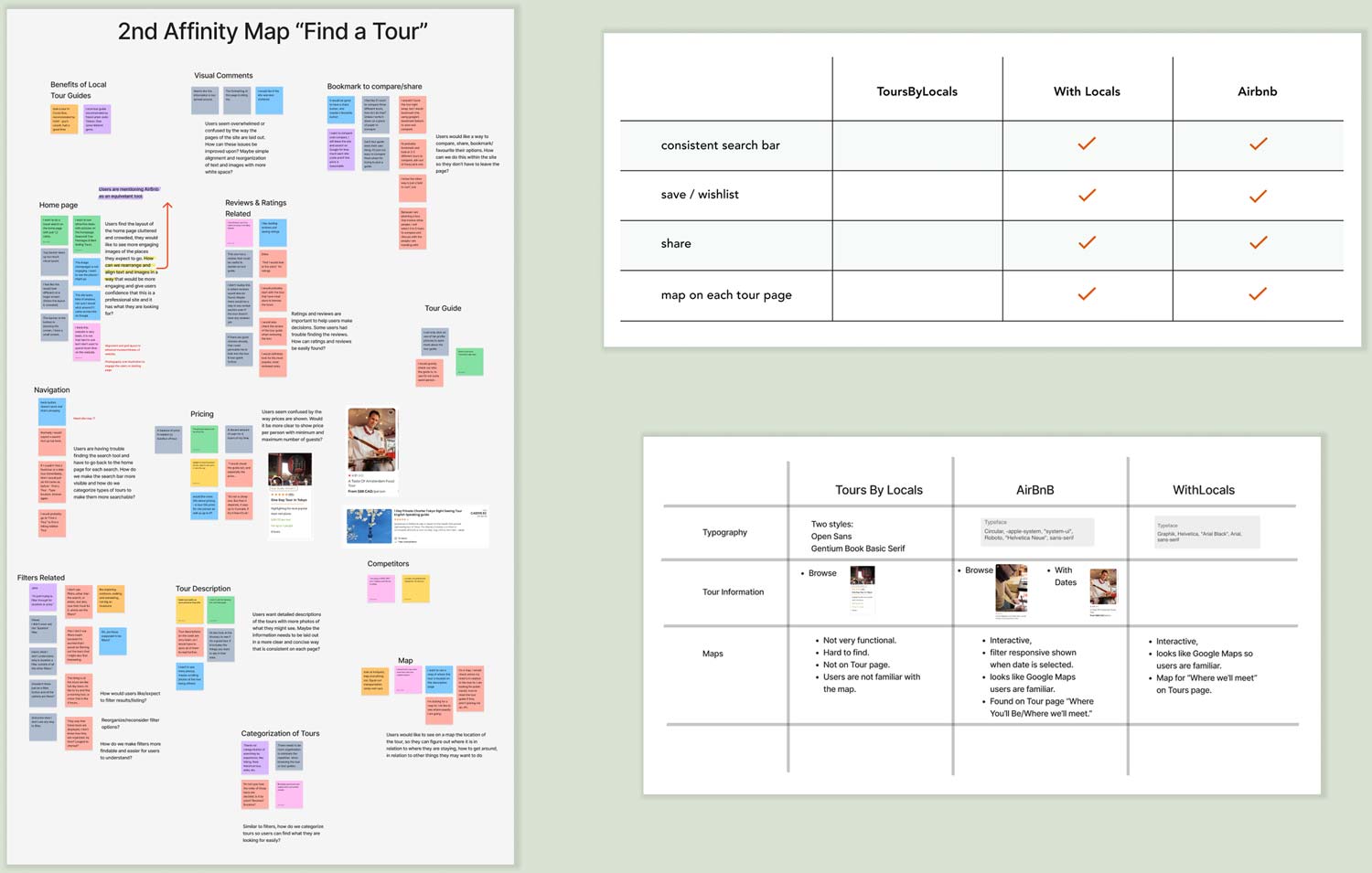
User interviews and task analysis were conducted to understand how users were navigating the site, while affinity mapping was used to reveal the most common and impactful pain points.
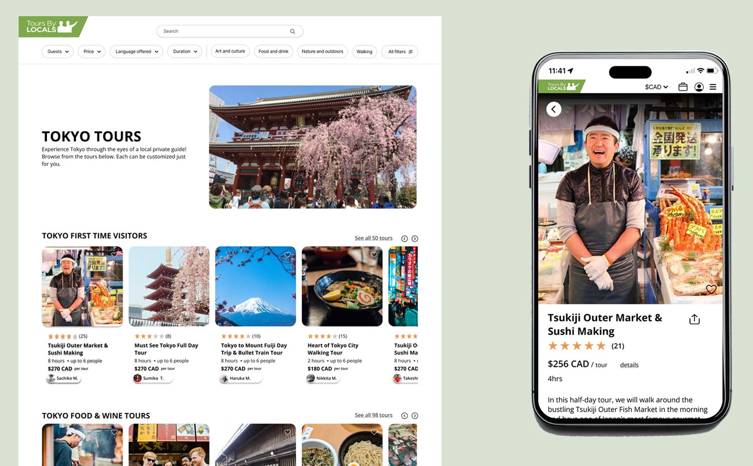
The research uncovered two main problem areas: visual clutter and poor navigation. Users felt overwhelmed by competing information and irrelevant content that distracted from what they actually needed, making the pages feel more complicated than necessary. Navigation added to the frustration when searching, filtering and returning to previous results were not straight forward tasks, leaving users feeling stuck.
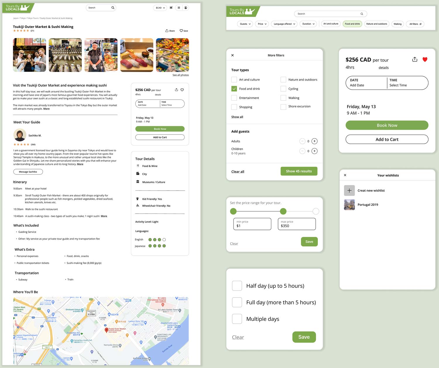
User interviews also revealed that some features that were expected as standard were missing or hard to find. Travellers wanted quick access to ratings and reviews, a map view on tour description pages, more detailed guide profiles, and the ability to save or share tours they were considering. A competitive analysis confirmed that many of these features existed on competitor sites but were missing or buried on ToursByLocals.
Having gone through a series of iterations we landed on more streamlined page layouts to reduce the visual clutter and display essential information more clearly. We kept many of the colourful visuals on the homepage to maintain brand consistency, but simplified the layout so that elements were aligned, less cluttered and easier to read. Navigation was improved with a persistent search bar, prominently placed filters, the ability to create a wishlist and added a sharing function.
Outcomes
The modifications resolved the friction points the users had identified, while bringing the site in line with competitor standards. The result was a more streamlined, intuitive experience focused on helping travellers find what they’re looking for with less effort.
Over time as the network of guides grows, and traveller expectations shift, new features will need to be added. A simple process for ongoing user feedback, such as surveys and interviews, would keep the service improving continuously rather than waiting years for the next big redesign.